On the most recent episode of Project Runway All Stars, the designers were asked to compete in teams to create a female look and a menswear look. Their designs were inspired by the wardrobe on Lifetime’s December miniseries about Bonnie and Clyde. Though their looks were to borrow elements of the 1930s era, they were told to update them for a contemporary runway and not to create costumes.
I looked around and…there was no one to be on a team with me. So I opted out of the menswear part of the challenge–though I did choose Frankie Stein as my model, and Frankie’s an androgynous name. Good enough!
I chose blue wool houndstooth for a masculine element, and white satin for the softer part of my design.
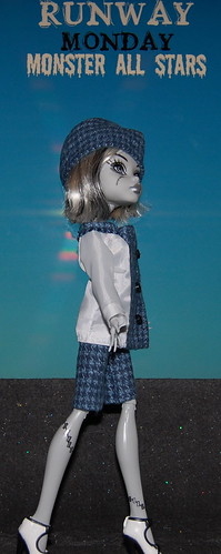
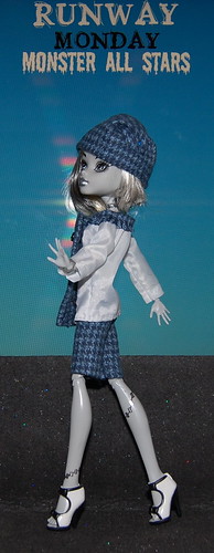
The collar on the satin part of the shirt is trimmed with frayed wool. The cloche hat is timeless.
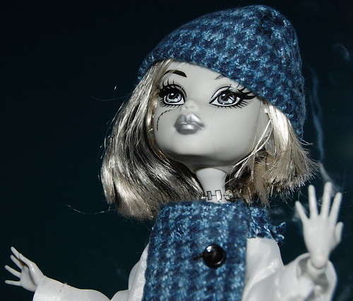
The shorts make the look younger and more appropriate for Frankie.
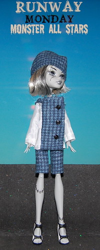
Mattel’s shoes are an updated nod to a bygone era.
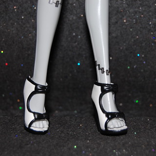
Lawbreaker? More of a heartbreaker.
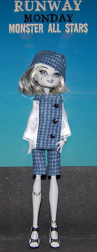
Hope you’ve enjoyed this week’s look. See you next time on the runway!
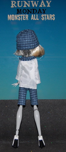
Previous looks from this season:
Week 4: Get Back to Class!
Week 3: There Are No Bad Cocktails, Just Bad Designers
Week 2: Bitten by the Fashion Bug
Week 1: You Got Punked
The All Stars were all either HITS or Misses last week. And you were a HIT, too. And who was the scary guest judge who looked like an escapee from Dr. Frankenstein’s lab or the House Of Wax.
Thanks! And sad to say, I don’t even remember the guest judge! I’m a little glad to get a break this week.
Okay, I just typed out a big old comment … and the computer ate it ! So take 2!
I told my viewing partner that someone was going to blow it with fringe and make their design more 20’s than 30’s. And of course it was Vicktor! In his original season he didn’t know the difference between the Edwardian era and the Victorian Era … GEESH! I also thought that Seth Aaron’s was a little too steampunkish, but I didn’t think that he was going to be in the bottom considering that Alyssa said she liked the dress so much that she was going to make out with him.
Now your design, I like it – especially the jacket. I think that the shorts give it a newsboy feel ….
I am going to watch Bonnie and Clyde though, BANG BANG!
Thanks. It was fun to create something a little different from my usual stuff. It’s a challenge to rethink sizes from the Model Muses to the Monsters. Those shorts were supposed to be looser fitting, but after I looked at them a while, I decided I liked them as they were.
I think I love everything about this outfit!! That cloche hat is especially cool, as it reminds me of Mrs. Madrigal in Tales of the City.
How did you feel about Jeffrey’s win? I thought for sure he would be OUT! That coat didn’t say 30s at all to me.
while not a huge fan of his design it was head and shoulders above the disco shiny thing that Michael made … and I’m sorry, Vicktor totally ripped of Brain’s big man suit from Pinky and the Brain
Check the video and you’ll see I’m right
http://www.youtube.com/watch?v=tjZE-Z2-vrw
Thanks very much, Gary.
I guess Jeffrey’s design was better than the others. It just doesn’t seem to me that any of them are really creating what I think of as “All Stars” level designs. Maybe I’m burned out on PR.
I like the hat and colors, but sometimes when I look at the jacket, I think the blue front is a scarf, yes, with buttons down the front, I know. I like it.
Thanks!